Showing posts with label tim holtz. Show all posts

Wednesday, February 10, 2016

The Daily Marker 30 Day challenge Day 8

Hi everyone, Michelle here with Day 8 of The Daily Marker 30 day challenge. 

Where did that first week go??? Here it is Wednesday already and I've already lost a day ... But lucky enough for all that is lost can sometimes be found. Thank God for that otherwise I would be still looking for my brain 😳😉 lol.


Since that big day is coming up where most celebrate that big word LOVE I thought I would pay tribute to all the loveliness. My card today was inspired by my lovely Heidi Swapp tiny heart stencil. Simon Says stamp has this wonderful stencil in stock. Here is the link: https://www.simonsaysstamp.com/product.aspx?id=127852


This project combined 4 main elements: Tim Holtz Distress Ink Pads/Blending Tools, Heidi Swapp Tiny Hearts stencil, Embossing Powder and the Close to my Heart stamp set called Sweet and Lovely. It really doesn't take too much to give you that wow factor and an idea, if you do not have a stencil, is to take a small heart punch and create your own by punching a pattern out of a heavy weight cardstock.

So I started out by cutting a heart out of a post it note. The easiest way to get a balanced heart is to fold the paper in half and then cut. I will be using both pieces of the cut out in this project.


Next I placed the heart under my stencil to create a blank space. I cut the heart out near the top of the post it so the sticky part will help it stay in place under my stencil. 


Coloring part ... My Favorite. Using a ink blending tool add colour to the top left, I started with Picked raspberry. You can either tap the colour down or use a circular motion, which I prefer. Then the next colour was Candied apple and then the final color was Seedless preserves. When switching colours make sure to overlap them so you get a blended look. 


Next give it a couple of spritz with your water mister. This help the colours to blend and gives the edges of the hearts a bit of a watercolour look. You can skip this step if you like. Once done remove the stencil and let dry.  TIP: you will have left over ink on your stencil, take the stencil and flip it over onto another piece of white paper and you will have another lovely piece of patterned paper. I am using that paper on my Day 8 project.


Next up I wanted to fill that "blank" area with an embossed heart.  This is where the post it "negative" comes in to play. Place it down overtop of the blank area and line it up with the edges of the hearts. Remember how I cut it out near the top of the post it, this is why. Now I have the sticky part on the top of the post it to keep it stuck down.  FIRST ( sorry I'm not yelling but really want you to do this part) use a powder tool overtop of the whole surface prior to putting down the sticky note. This will help to keep the embossing powder from sticking to the whole paper.


Time to add in the Emboss it by Ranger. This stuff creates a sticky surface for the embossing powder to stick to.  Dab it on, over top of the blank area of the post it, generously. You want lots of that goopy stuff down.

Remove the sticky note and then add your embossing powder. Tap off the excess into a coffee filter which makes it easier to put the excess powder back into the jar. I used a powder, which I am coveting, from a company that unfortunately is no longer in business (very sad). This powder has a mix of red, pink and purple which you could recreate yourself by mixing those colours together. Brilliant why did I JUST think of that! 


Yummy I just love that picture!! Continuing on, take your heat gun and apply heat to the powder just until it melts.  Do not over melt it because this will cause it to smoke and then possibly catch on fire .. No fires allowed!! 


Voila!! Enter the yummy looking shiny heart. This kind of reminds me of a gummy heart!! 


Now we want to add the sentiment. I thought this "lovely" stamp from the Close to my Heart Sweet and Lovely stamp collection would go perfect on top of that heart. I like to use Rangers Archival ink on almost everything as I like how it really stays and gives you a nice crisp stamp.

So that's my project for today. I am a day behind on the challenge due to me having come down with a really awful cold so I will be skipping one day this week but "I'll be back"!!! As Arnold would say. 

Cheers everyone and happy creating!!


Monday, February 8, 2016

The Daily Marker 30 day challenge - Week one recap (Day 3)

Hi everyone here again with my recap of The Daily Marker 30 day challenge. 

Day 3 - Blooming watercolor

Today's post is using one of my Favorite techniques I call Emboss it, Drop it, Blend it and Voila! I don't really call it that but I thought it was cute (haha) Seriously though I love how this looks on any project. All you do is stamp your Favorite image on Watercolor paper with Versamark (use a stamp that has some white space that you can color), add embossing powder and heat it up to melt the powder, draw some color into the white space ( two levels of the same color per petal/stem), take your Watercolor brush (not too much water on it) and blend. If you find that you need more dimension just wait for it to dry and add more colour where you need it. That's it! It's that easy - Really it is and it takes hardly any time to create these lovely little bouquets.

I originally started with the gold one but wanted to try one with clear embossing powder as well. It's a toss up for me which one I like better. The elegant gold or the ethereal clear???


Supplies: My go to Watercolor paper (Strathmore yellowbook), Tim Holtz Flower Garden cling stamps, Ranger Queens gold embossing powder, Clear embossing powder, Tim Holtz Distress Markers in (Purple flower- Seedless preserves, Wilted violet, Spiced marmalade, Fired brick, Carved pumpkin), (Red flower- Candied apple, Fired brick), (Teal flower - Lucky clover, Cracked pistachio, Lemon citron), (Stems - Forest moss, Peeled paint)

Monday, October 12, 2015

In the Christmas spirit


Last weekend I joined 23 other ladies in a crafty fun weekend at a beautiful little lake called Gardom Lake just outside of Enderby, BC.  If you've ever been to this neck of the woods you know how beautiful and lush the forest are here.  To me it's a magical little place with paths meandering through the forest and log cabins that make you feel like you are miles and miles away from anywhere.  The retreat was a 3 night card making fest for me and my focus was all around Tim's mini blueprint Christmas stamps and his holiday wreath.


I created numerous embossed and watercolor cards that reflected the beauty around me.  I kept things simple but elegant using Rangers Queen's gold embossing powder and Tim Distress Markers in: Fired Brick, Tattered Rose on the poinsettia's and holly berries. 


I used Pine Needles and Forest Moss on the pine branch and on the holly leaves.  


For the center of the poinsettia and for some of the stamp descriptions I used Spiced marmalade and Fossilized amber.


 My background paper is by Authentique from their Tidings collection.  I love love love this paper!  I walk around telling people to feel it, which may sound strange, but if you know Authentique you know that the quality of their paper is nothing short of amazing.


My instructions are quite simple.  I cut out the watercolor paper and the patterned paper using my Avery-elle double pierced rectangle dies.  I used the largest rectangle for my patterned paper and then the next size down to cut out my watercolor paper.


I stamped the images on my watercolor paper with Versamark and then added Rangers embossing powder.  I heat set it and then put it aside.  I did this step numerous times so I could get my cards all done at once.

Then i took my distress markers and added just a little bit of color to my stamped images.  Once I added the color I took my watercolor pen and added movement to the color.  Basically I blended the two colors together.  It doesn't take a lot of color on your stamped images to get a really great effect so use your markers sparingly when adding color to your stamped image.  I will try preparing a video (first time eeks) to show you how I add color to my stamped images.

I stamped each card using Tim's Mini Handwritten Holidays stamps.


I drew on the stamp with a mix of my Forest Moss and Pine Needles markers and then stamped directly onto the card before it dried.  No worries if it dries up on you too quickly because you can just give it a very light mist of water and it will reactivate the ink so you can stamp it.

Finally I mounted the background piece onto a kraft blank card and then layered the watercolored image on top.

Although these were quite simple to create I love the end effect of less is more.

Have a wonderful day!


Saturday, September 26, 2015

Birds and the Bees repost

Hi all,

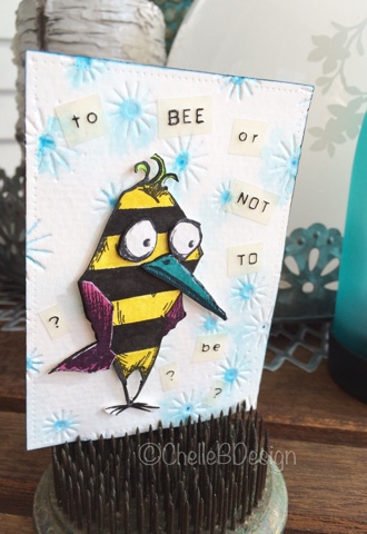
I'm back today with a project I created about 9 months ago. I was involved in an ATC challenge themed "Birds and Bees" and I was lucky to borrow my good friend Barb's Bird Crazy stamps by my favourite guy Mr. Tim Holtz.  Here is my original project from Pinterest.


I had the bird part covered but was perplexed as to how to incorporate the bee part into my ATC. Finally I had this crazy, and aren't these birds all about crazy, idea to stripe my bird like a bee. Voila, birds and bee all rolled into one! Now to come up with a quote for the card. Lucky me that Barb was around and came up with the quote "to bee or not to be". How fitting! Thanks Barb!!

My handsome bird/bee has drawn a bit of attention on Pinterest so I thought I would recreate him, with a couple of tweaks, for my blog and here it is. 


First I embossed a piece of watercolour paper with my new Tim Holtz/Sizzix embossing folder "Sparkle". Then I coloured in the center of each sparkle with my Mermaid Lagoon distress marker. I gave the paper a few spritz of water with my mini mister to help the distress ink spread. Then I put that aside to dry. 


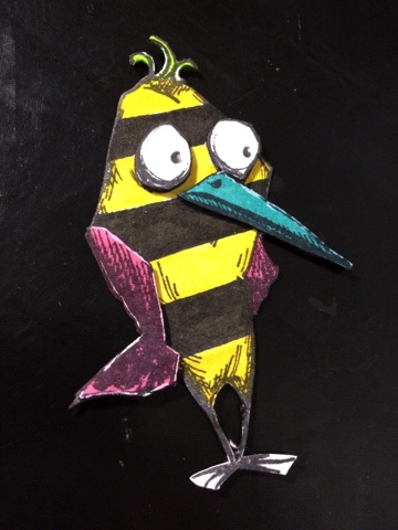
I stamped Mr. Bird twice onto my watercolor paper. One is for the main bird and the second is for his wing, beak and eyes. I cut those out and set aside. 


My first colouring was the bird base with the stripes on it. With a light coloured pencil I drew my stripes onto the bird as a guide. 


Then I coloured in my yellow and black stripes. Next I coloured in the wings, beak and tuft of hair. Even though these will be covered by my second layers I still like to colour them in as that layer will be popped up.  


Final step was to color in the second layers. 


After colouring I assembled my bird. I added pop dots to the second layers of the bird and placed them onto the first layer. I did take a gelly roll white pen and added a bit of highlighting to that second layer to add some depth. 


Using my Dymo machine I spelled out my quote in two different fonts. I find it adds a bit more visual interest if you mix up your fonts a bit. I cut those out into individual words. 


I placed them onto my background sparkle embossed paper once it had dried. I used a Faber Castell Pitt pen to make the words stand out on the white background. The words were a little too light without the added black. 

Lastly I added Mr. Bird and there we are. 


I hope this inspires you to think outside the "bird" and to try something a little different. 

Friday, September 18, 2015

Fall'ing for minis

Fall is definitely within our reach! Cooler nights, leaves changing colour and more time to spend in my craft corner! Woo hoo!! I love summer but fall is just so beautiful and it gives me even more of an excuse to spend time in my craft corner! 

Today's project was inspired by the amazing Hero Arts. 


I recently purchased the Lia Build a Wreath Hero Arts stamp set from one of my favorite stores, Memories and More. It's so adorable! So many tiny little stamps that have so much possibility.


I started out by cutting a piece of heavyweight watercolor paper using my Avery-Elle Double pierced rectangular dies. These are my new favorites!


I very lightly traced a circle into my paper to use as a template for my wreath. I inked and stamped one stamp at a time onto my circle. In total I used 7 stamps from the set. I stamped each stamp 5 times in random angles around the circle.  For colour I used my Tim Holtz Distress markers to ink the stamps. I inked and then stamped quite quickly so that the ink didn't dry on the stamp. Here are the colours I used. Plus I also used Fossilized Amber for a little pop of brightness (not shown)


Once the wreath was complete I added the bird to the bottom of the wreath. I stamped it three times using a different color each time. As a final touch I used my Hero Arts mini wood stamp - Hello and added Liquid Pearls in Garnet to emphasize the berries.


I hope you've enjoyed my short and sweet tutorial. Happy Friday.

Michelle


Monday, September 7, 2015

Aloha Fall


Fall is slowly creeping into our midst but in my creative world summer has arrived. 

My project today is inspired by the newly released My Favorite Things Polynesian Paradise stamps and die set. While I normally tend to lean towards the distress style of crafting I couldn't help but fall in love with this cute little set.  Little doesn't seem like the right word for all the amazing amount of goodness in these sets. This set is packed with fun little sayings and characters. How about the little turtle!! So fun


Here is what the stamp and die set look like.


How great is it that you get all those pieces and what amazing options.

Here is a overview of the products I used to make my card and the steps.

First I used my Avery-Elle "elle-ments" Double pierced rectangles die set to cut out my watercolor paper for the background. I can't express just how much I love these dies. That little bit of added stitching around the sides is the best! 


Next I added a cloudy background to my watercolor paper using the Memory Box - Mini clouds stencil and Rangers Texture Paste in Transparent matte. I wanted a very light texture in the background for dimension. 


I coloured in the background ever so slightly using Tim Holtz distress markers. I swiped three rows of colour over the paper and then generously misted it with water using my mini mister. The colours I used were Blueprint Sketch, Stormy Sky and Iced Spruce. I put that aside to dry. 

Next up I coloured in my aloha girl and flowers also using the Tim Holtz Distress Markers. Here is a pic of the colours I used on the girl and the cloudy background. I cut her and the flowers out of watercolor paper as well. 

Cloudy sky and flowers.

Hula Girl

I cut out the Aloha saying using my Avery-Elle dies and then stamped it with Mowed Lawn and Seedless Preserves Distress Markers. 

Once the watercolor background had dried I took my Walnut Stain Distress Marker and added the sandy base that is under her feet. I just scribbled some colour on and then took my watercolor brush to spread it out. 

I assembled all the pieces together using a combination of pop dots and Sookwang tape. I popped up the Hula girl, flowers and Aloha. 

The card base and purple background are from Craft Smith paperpack and card packs.

Hope you are enjoying your Labour Day!

Michelle

Sunday, August 30, 2015

Watercolor Crazy

Back in the spring I started experimenting with watercolor backgrounds using the Tim Holtz distress markers and boy am I having fun with it. My first card was a Father's Day card which turned out so great! 

I followed it up with another card.


Since then I have grown my distress marker collection immensely! My poor debit card! 

I purchased the Poppy Stamp Boddington Tree Cluster die recently and thought it would be fun to use the cutout on my existing watercolor technique. The results were great. Instead of stamping with black ink this is another great option. 


At this point I have realized that watercolor makes me happy! I have so much fun seeing how the colours blend and matching different cours together. 

Hope you enjoy my projects!