For quite some time now I have had a mild obsession with everything Paris. Whether it be the glorious architecture, the Eiffel Tower or just the over all feeling it conveys it has me hooked. I hope that one day I will be able to pay it a visit so I can see it for myself. For now I will admire it from afar and admire it I do.
When Tim Holtz came out with his Fleur de Lis & Eiffel Tower Alterations die I fell in love. I knew this die would take me to new places on my creative journey. Yesterday it was the inspiration for my tag. This was one of those projects where I couldn't help but be excited the whole way through because my creative journey just grew and grew on this one.
I'll try to keep my post short but I am going to include lots of picture on this one so you can see all my techniques and products that I used and there was a lot for such a small project. Here we go:
First off I started with a blank tag and a pretty little piece of paper from Recollections. I glued the paper down using Tombow Multi Mono liquid glue. This is my go to glue for almost everything.
Once the paper was glued down onto the tag I prepped my modeling paste mixture on my craft mat. I used about a Toonie size dollop of the modeling paste and a dime size dab of my black acrylic paint.
As you can see I didn't mix it completely. I like to have variations in the paste when I apply it over the stencil.
Once the paste was ready I taped down my stencil over my tag. In this project I used Memory Box - Diamond stencil. These are awesome size stencils for tags.
I smeared the paste mixture over my tag using a Size 1 craft palette knife. Some areas I left thicker than other to create more dimension.
After removing the stencil this is what it looks like. I waiting "patiently" for it to dry. I prefer not to use a heat tool to dry it as I find they tend to warp my paper and I wanted this to stay very flat.
Next I pulled out my Tim Holtz Alternations Fleur de lis & Eiffel Tower die. Love, Love, Love this! I used a very heavy chip board in black to cut out as I wanted the tower to be sturdy. You can find this chipboard at most craft/scrapbooking stores. I purchased this from my local store out of their bulk supply. Notice that I only cut out half of the fleur de lis. I did that on purpose because I knew the tag didn't have enough room for both pieces on it so I only cut out half.
I applied a thin layer of Tim Holtz Distress Stain in Brushed Pewter to the cut out pieces.
Next apply a layer of Stampendous Frantage embossing enamel in Aged Scarlet. Note that this lovely stuff likes to fly off your paper when you apply your heat gun to it. I find it helps to apply a fairly thick layer of Emboss It by Ranger to the surface so it grabs the enamel better. You could even tap it into the embossing product so that it really grabs. For those new to embossing, this product is applied prior to adding your enamel to the surface. Heat with your tool gun and it will melt to your paper. Careful with this step because you don't want to over heat it and see smoke coming off your paper. Yes I have done that :-)

Next I prepped the metal bits with acrylic paint and some glossy accents. The cute little gold frame came from Dime Store Emporium and the wander tag is by Tim Holtz. The clock bottle cap I will talk about more in the next step. Apply a sufficient layer of Tim Holtz Distress paint in Broken China to both pieces. One step I missed taking a picture of was when I also applied a thin layer of Black chalkboard paint to both pieces. I found this at my local dollar store. Once that was dry I filed off some of the paint to give it a grungy look.

The lovely little bottle cap in behind the clock I believe is from Graphic 45. Sorry, I am one of those people who repackages their products once I get them home from the store so I lost the packaging. The clock face and tiny little gears were given to me by my lovely friend Barb. She purchased these when she was traveling so I unfortunately do not know where they came from but you can find this type of thing on Ebay. Just search for "watch parts". The steps in this are as follows: I enameled the bottle cap with Stampendous Frantage embossing enamel in Aged Aqua. I took my Emboss It dabber from Ranger and dabbed embossing all over the cap. I then sprinkled the embossing enamel over the cap and then heat set it with my heat gun. Use tweezers to hold the cap, she gets hot hot hot! Step 2 I placed the watch face into the cap and filled it with Glossy Accents by Ranger. Once filled I dropped in a few gears and miscellaneous watch parts. I let this set over night.
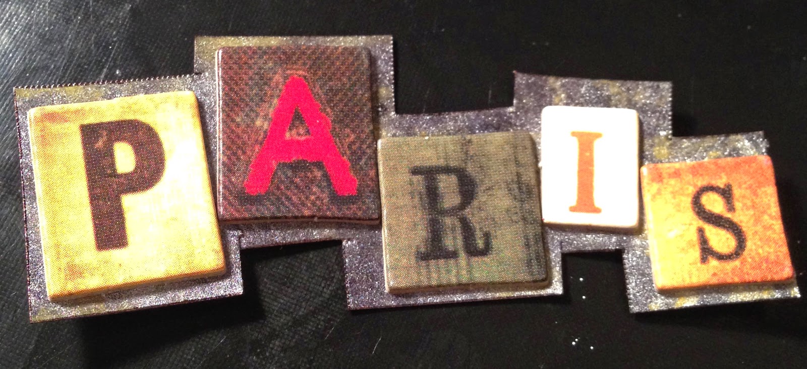
The "PARIS" letters are from Tim Holtz. I took these and glued them onto a piece of paper with Tombow Multi Mono Liquid glue. Once it was set I cut around the letters until it looked like the above picture.
Next step was to prep my ribbon for the top of the tag. I used two types of May Arts Ribbon. The white ribbon, as shown above is great for stamping on. I stamped the word "magnifique" onto the ribbon repeatedly with Archival Ink by Ranger. This makes it permanent.
Once my words were stamped I colored up the ribbon with Tim Holtz Distress Stain in Peacock Feathers and Crushed Olive. I dabbed the color on my craft mat and laid the ribbon into the color. First I did the Crushed Oliver all over and then added a little bit of the Peacock Feathers for accent. I crumpled the ribbon really well when it was wet so it would looked more aged. I also added in another piece of ribbon behind all the embellishments. This was from Michael's dollar bins and I colored it with Tim Holtz Distress Stain in Peacock Feathers as well.
Once all the pieces were prepared I built the tag in layers. First was the stained ribbon. Then the Eiffel tower and Fleur de Lis. I attached these using my Tim Holtz mini attacher (this is the most amazing tool ever). I then attached the feather. I glued down the frame, Paris and bottle cap with Zip Dry glue. Great stuff but use in a well ventilated area as this glue has a strong odor. Next I attached the metal "wander" tag and a tiny little key (in behind) onto the ribbon. I tied the ribbon onto the tag and voila! Tres chic!
This was a lot of fun. I hope you enjoy looking at it and following my tutorial! As always please feel free to ask me any questions about my steps or products that I used.
Head on over to the
Simon Says Stamp Blog for Monday's challenge entitled Journey. This is my take on the challenge.
After looking at the picture up on my blog I decided I needed to move the feather to the middle center of the tag to fill up the empty space. I like it much better there :-)