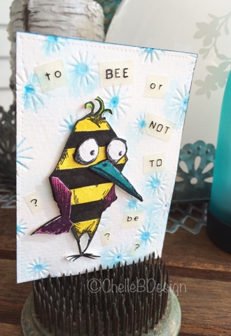
I'm back today with a project I created about 9 months ago. I was involved in an ATC challenge themed "Birds and Bees" and I was lucky to borrow my good friend Barb's Bird Crazy stamps by my favourite guy Mr. Tim Holtz. Here is my original project from Pinterest.
I had the bird part covered but was perplexed as to how to incorporate the bee part into my ATC. Finally I had this crazy, and aren't these birds all about crazy, idea to stripe my bird like a bee. Voila, birds and bee all rolled into one! Now to come up with a quote for the card. Lucky me that Barb was around and came up with the quote "to bee or not to be". How fitting! Thanks Barb!!
My handsome bird/bee has drawn a bit of attention on Pinterest so I thought I would recreate him, with a couple of tweaks, for my blog and here it is.
First I embossed a piece of watercolour paper with my new Tim Holtz/Sizzix embossing folder "Sparkle". Then I coloured in the center of each sparkle with my Mermaid Lagoon distress marker. I gave the paper a few spritz of water with my mini mister to help the distress ink spread. Then I put that aside to dry.

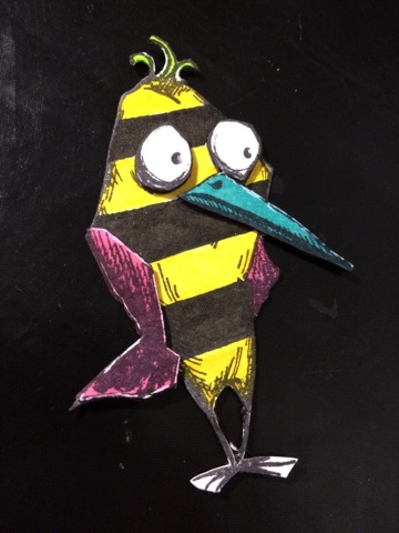
I stamped Mr. Bird twice onto my watercolor paper. One is for the main bird and the second is for his wing, beak and eyes. I cut those out and set aside.

My first colouring was the bird base with the stripes on it. With a light coloured pencil I drew my stripes onto the bird as a guide.

Then I coloured in my yellow and black stripes. Next I coloured in the wings, beak and tuft of hair. Even though these will be covered by my second layers I still like to colour them in as that layer will be popped up.

Final step was to color in the second layers.

After colouring I assembled my bird. I added pop dots to the second layers of the bird and placed them onto the first layer. I did take a gelly roll white pen and added a bit of highlighting to that second layer to add some depth.
Using my Dymo machine I spelled out my quote in two different fonts. I find it adds a bit more visual interest if you mix up your fonts a bit. I cut those out into individual words.

I placed them onto my background sparkle embossed paper once it had dried. I used a Faber Castell Pitt pen to make the words stand out on the white background. The words were a little too light without the added black.
Lastly I added Mr. Bird and there we are.

I hope this inspires you to think outside the "bird" and to try something a little different.
Awesome card! Definitely one of my favourites. I just love it!
ReplyDelete^Loek M.
DymoSupport
Thanks so much! He was a lot of fun to create 😃
Delete