Sunday, May 15, 2016

Did someone say Alcohol??

I hope that title grabbed you because I do like to add a little excitement to my posts and while I'm not referring to the drinking kind of alcohol I am using a different type on today's card.

I am constantly absorbing new, or new to me, ideas on how to create WOW cards and for today's post this is definitely a fun new way to look at backgrounds for your cards.  In reality it's like I am creating my own paper which is so much fun!  If you know me you know I like to have fun, especially if it's when I am creating cards. The full instructions on how to create this gorgeous alcohol ink background can be found at the bottom.  Enjoy and please feel free to drop me a comment at the bottom.


The stamps you see on the forefront of the card are by Altenew and it's their Beautiful day set.  I love this set because it offers so many possibilities for stamping.  The stamps are a layered type of stamp but as you can see I only used the final layer of the stamps which is the outline.

Other supplies used:
Copper embossing powder (I prefer Rangers powders but you can use any powder you like)
Versamark embossing ink pad
Bazzil cardstock
Brads (Any colour will do as you can just emboss them with the copper embossing powder to adapt them to your colour scheme)
May Arts ribbon
Foam mounting tape


Alcohol background technique
The supply list for the background is quite small:
Alcohol (like the rubbing kind - first aid) 90% or above.
Ranger Adirondack Alcohol Inks
or
Ranger Archival Ink Re-inkers
Palette Knife
Ranger Specialty stamping paper

1. Cut your paper to the desired size
2. Generously drop the alcohol onto your paper.  No need to cover the whole paper completely just large drops here and there.  It works easier if you put the alcohol into a smaller bottle before dropping onto the page or you can also use a eye dropper type of device.
3. Drop 1 to 2 drops of the chosen colours (I use 3 colours and then a metal ink like copper) of either Archival or alcohol inks onto the paper.
4. Using your palette knife (kind of like spreading butter) spread your ink/alcohol throughout the paper.  Do not spread it too much as you want the colours to be blended but not so much that you end up with one colour.  It's also okay to leave white areas as this adds interest.
5. Put it aside to dry and that's it.  It really is that easy.

Once it is dried, which depends on how much ink you've added, you can then embellish as desired.


Friday, May 13, 2016

Wading in watercolor

Creativity is contagious, pass it on - Albert Einstein

Such a great quote and one of the many reasons why I love to share my creations.  I've learned so much from many people and feel that passing it on is another way I can pay it forward.

Today's post is all about watercoloring with the non-traditional methods.  I discovered watercoloring with Distress markers quite a while ago and have been having fun with this technique ever since.


To begin I started out with a piece of Strathmore Bristol paper cut down to 4 1/2 x 6.  I stamped the Altenew Peony Scrolls flowers and leaves with Versamark onto my paper.  I then added Rangers Queens Gold embossing powder and applied heat with my heat tool to melt the powder.  On a separate piece of paper I stamped a peony and some leaves so I could fussy cut those out for later.


I scribbled variation of pinks and purple Distress markers onto a clear acrylic block.  Using my waterbrush, which was wet, I picked up colour from the block and began coloring in the images. The more water on your brush or on the paper the more variegated effect you will have with the colours. Once the flowers and leaves were dry I added in my background colour behind the flowers.  Again I placed the colour on my acrylic block and then picked it up and applied it to the paper.

Once the background layer was dry I cut a piece of vellum and stamped on the "Thank you" sentiment with Versamark, added the Queens gold embossing powder and heated it to melt the powder.  I wrapped it around my watercolor paper and taped it at the back to secure.  I then applied the extra flower and leaves over top of the vellum for added dimension.

Lastly I mounted the watercolored paper to a piece of recollections purple cardstock using 3d foam tape and then mounted it onto a blank card. 

Thank you for popping by and if you have any questions about the products used or techniques please feel free to drop me a comment below. 

Most of the products used were purchased from my local store Memories and More in West Kelowna, BC. ( www.memorycrafts.ca )as well as from another local B.C. store called All Ways Scrapbooking ( www.allwaysscrapbooking.com ) from Salmon Arm.  I like to support local when possible. 


Thursday, May 12, 2016

Playing with inks

Hello!

I'm back today with some fun cards I made last weekend. I learned a fun "new to me" technique from my super duper crafty friend Maresa.  After being in the industry for a number of years she is a wealth of crafty ideas and techniques and this one technique had my eyes glued to the paper. It's the alcohol/archival ink reinker technique and it creates these amazing backgrounds for cards.

All you do is take a piece of Specialty Stamping paper, drop on some alcohol (the medical kind and the higher the content the better), add a few drops of archival ink reinker (3 colors seems to work great) and then very slightly blend with a palette knife. Spreading the ink through the alcohol like you would do if you were spreading peanut butter on bread but with a lighter touch. Voila .. That really is it!!! It dries in no time at all.


On my second card we stamped an image with Versamark, embossed the stamped image (Altenew poppy stamps) with ranger "queens gold" embossing powder. With a damp watercolor brush we picked up colour from an acrylic block (one drop of each color onto the block) and coloured in the stamped image (poppies in this case). Once it was dry we added masking fluid over the coloured in image. Let that dry and then proceed with the same steps as the first card. Once dry, peel or remove the masking fluid with an eraser. I love love love this technique and will be sharing more projects with it in the near future. 


Thanks so much for stopping by!! Feel free to ask questions about my supplies used or if you are unsure about the technique!

Michelle 😉


Sunday, May 1, 2016

Day 4 - Online Card Clases "Clear & Sheer"

Happy Sunday everyone,

Welcome back to my Day 4 take on Online Card Classes "Clear & Sheer".  Day 4 brought us many creative ideas on working with vellum and acetate.  Acetate brings such a subtle effect to any project even if it's the main focus or if it's just a small accent on your card. Vellum is much the same .. it's a surface that can be altered in many ways and can create pretty ethereal results.  I'm learning to work with both as they are quite new to me.

So for today's project I decided to make a really basic card that let the focus be on the die cut.  Sometimes simpler is better and in this case I think it works quite well.

The key for working with acetate is that if you glue something to the front of the acetate you have to follow up with gluing something to the back to cover up the glue.  You work with layers so cutting out multiples of the same thing is key in this case.  Also in order to have an area to write on, inside the card, you have to follow this same rule of thumb where you have to double up on your layers.  


Hope you've had a wonderful weekend and I'm looking forward to our wrap up session later this week.  I hear shaker cards are in our future ;-)

Supplies used:
Opus art supplies - heavy weight synthetic acetate
Sizzix (Tim Holtz alterations) - Globe die
MFT Stamps - Label maker sentiments clear stamps
MTS Die-namics - Label tape dies
Strathmore - Bristol paper (white)
Bazzil - Black cardstock
Ranger - Archival Ink in Jet Black and Multi Medium Matte adhesive
Scrapbook Adhesives - 3D foam squares


Saturday, April 30, 2016

Day 3 - Online Card Classes "Clear & Sheer"

Hi All,

Welcome back to my Day 3 homework for the Online Card Classes "Clear & Sheer".

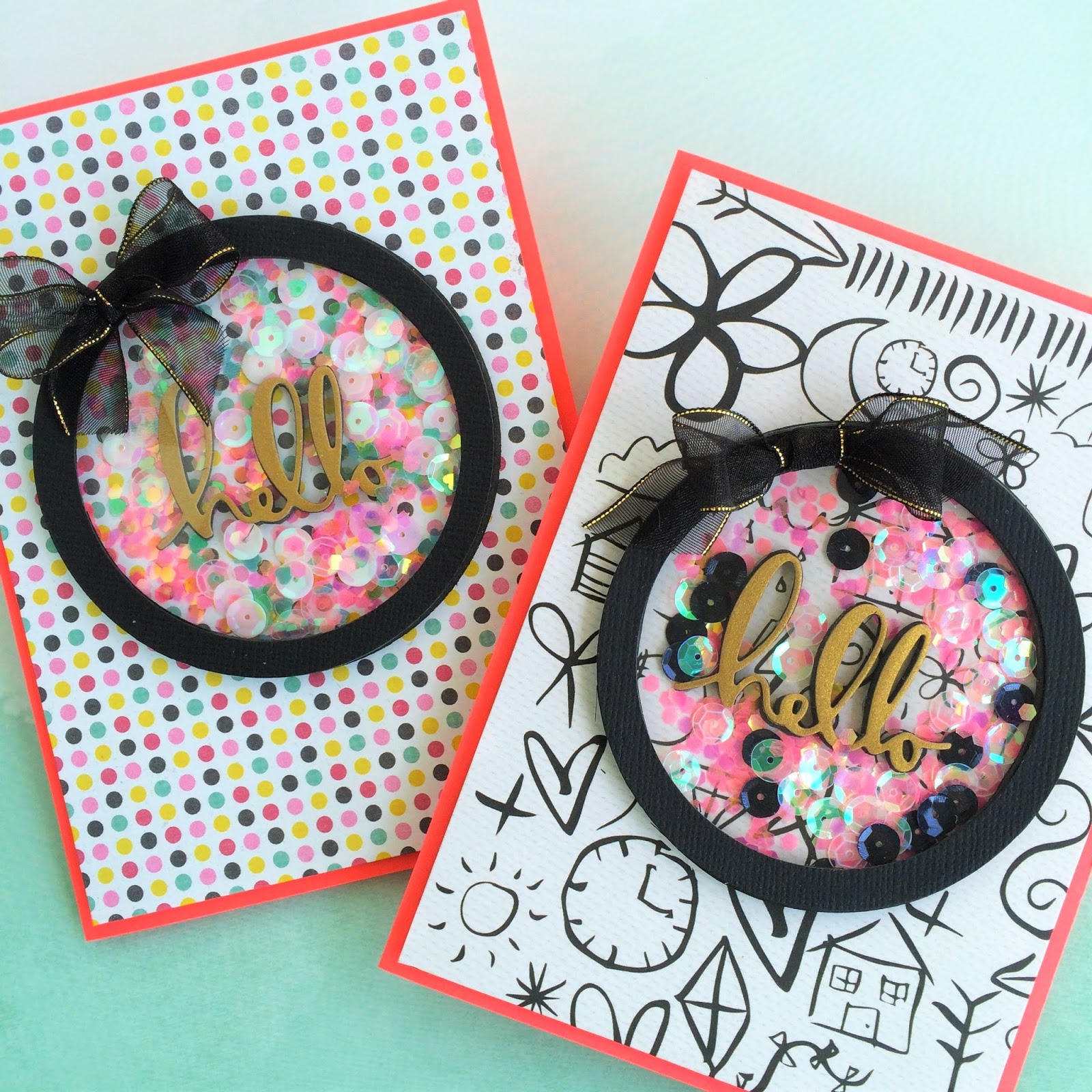
Today I decided to go with the tried and true use for Acetate which is for shaker style cards. In the past year or so shaker cards seem to be the new "Pantone color of the year", so to speak, for us paper crafters.  I mean, how cute are they!!  Sparkling things that move around on your card .. can you say "Squirrel"!! haha.  Such a great way to add visual interest to your cards.

While I did go with the basic use for acetate this assignment, I do have to say that sometimes shaker cards can be a bit of a chore to make.  The shiny bits like to stick to everything and the acetate attracts everything, including my lovely cats hair .. OY!  So while I love making them it probably takes me just as long to remove all the little static'y bits from my acetate as it does to make the card.  That might be a bit of a exaggeration but at the time it doesn't seem like it :-) I did follow the "water" technique as shown in one of the videos and that did help a bit to remove some of the static.

So here are my bright and vibrant shaker cards for Day 3.  I have to say that this class was so worth signing up for because not only is it challenging me to think outside the norm it is also giving me a bit of a boost that I needed right now to get my creative butt in gear!  So thank you to all the wonderful teachers .. I'm forever grateful!

Hope you enjoy!  Have a great weekend.


Supplies used:
Memories and More - Open stock vellum
My Minds Eye "Cambridge court" - Dotted paper
KaiserCraft "me Collection - Doodle paper
Dollar Store - Sequins
Martha Stewart crafts - Mini heart sequins
May Arts - Black ribbon with gold edge
Recollections - Card base and gold "hello" paper.
Poppy stamps - Hello die
Bazzil - Black card stock
Darice (Memories and more) - 3mm black foam sheet
Ranger - Multi Medium Matte
Dollarama - Foam adhesive tape (found in automotive aisle - super cheap option for pop up foam tape and it is super sticky)


Friday, April 29, 2016

Day 2 - Online Card Classes "Clear & Sheer"

Welcome everyone to my Day 2 post from my Online Card Classes "Clear & Sheer" adventures.

Today we saw some amazing video's around taking vellum to a new level by dry embossing it, coloring it, using it to mute a busy background and making envelopes with it.  All great ideas that I will definitely take away with me on my creative vellum journey.

My take on Day 2 was to use my Zig Emboss Writer pen to highlight the gorgeous pattern on my paper underneath the vellum.  While the vellum mutes the background the gold embossing highlights the areas you want it to.  That is what I love about using an embossing pen.  You literally draw where you want, add powder, heat the powder and voila!  Instant embossing highlights how and where you want them.


Background paper
Supplies List:Simple Stories - So Fancy patterned paper and hello flag base.Recollection - Vellum and card baseRanger - Queens Gold embossing powderMay Arts - Gold edge pink ribbonPrima - Crystal gem/gold wireZig - Emboss it writing pen (LOVE LOVE and a must have)Thanks for stopping by!

Thursday, April 28, 2016

1st time participant in Online Card Classes

Hi Everyone,

Michelle here and welcome to my 1st post as I join Online Card Classes - Clear and Sheer session.


A great crafty friend (Maresa) told me about this fun class that she was taking part in and I was intrigued as to what these classes were all about so I decided to join myself.  I've always loved the way vellum and acetate looks on cards and look forward to learning more about ways that I can use them on my cards.

After watching Day 1's videos I decided to use a pre-made piece of watercolored paper that I had worked on a little while ago.  I knew I would find a great use for it and after watching Kristina's video I knew exactly what would make a great base for my card.

Inspired by her video I decided to use the negative and positive cut outs of my design on my card but in reverse order.  The positive cut outs underneath and the negative cutout on top.  I think it turned out great and I love the way the sequins and teeny little stars add a little bit of wow factor to my card.

Hope you enjoy!

Supplies:

Yarka - Watercolors 
Die-namics - Lucky stars dies
Memory box (mb clings) - Reach for the stars stamps
Ranger - Queens gold embossing powder (LOVE this stuff)
Martha Stewart - Teeny stars
Dollar store - Sequins and foam adhesive tape
Strathmore - Bristol Paper
Recollections - Card base